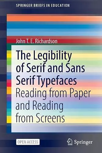
The Legibility of Serif and Sans Serif Typefaces
Reading from Paper and Reading from Screens
Format:Paperback
Publisher:Springer Nature Switzerland AG
Published:16th Feb '22
Currently unavailable, and unfortunately no date known when it will be back

This book explores the legibility of serif and sans serif typefaces, providing insights into their historical development and impact on reading across various mediums.
This open access book provides a comprehensive and current review of the literature concerning the legibility of various typefaces, with a historical perspective spanning over 140 years for printed materials and more than 50 years for digital screens. It delves into the evolution of serif and sans serif styles, tracing their origins from ancient inscriptions to their integration into contemporary printing methods. The book also assesses how these typefaces perform in terms of legibility across different contexts and demographics.
In addition to exploring the historical development of typefaces, the text examines recent studies that analyze the legibility of serif and sans serif fonts when utilized in digital environments, such as internet browsers and mobile devices. A significant focus is placed on understanding how these typefaces compare in both printed formats and on-screen presentations. The research highlights the varying preferences of readers for different typefaces, providing valuable insights into the factors that influence legibility.
While the primary emphasis of The Legibility of Serif and Sans Serif Typefaces is on the psychology of reading, the findings have important implications for education and publishing. The insights shared in this book will benefit anyone involved in the communication of written text, whether in print or digital formats, making it a valuable resource for educators, designers, and publishers alike.
ISBN: 9783030909833
Dimensions: unknown
Weight: unknown
161 pages
1st ed. 2022