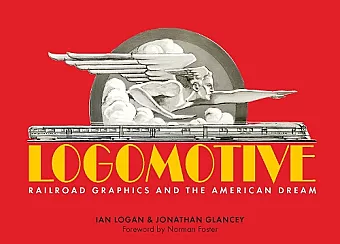
Logomotive
Railroad Graphics and the American Dream
Jonathan Glancey author Ian Logan author
Format:Hardback
Publisher:Sheldrake Press
Published:10th Dec '20
Should be back in stock very soon

In Logomotive Ian Logan's photographs are assembled into chapters and picture essays recalling the great days of lines such as the Santa Fe, the Union Pacific, and the Kansas City Southern. Some of his journeys are presented as travelogues in which he meets the Fat Controller, gets to sound the horn, and wanders into freight yards to see the last generation of streamline locomotives rusting amid the weeds. Animal motifs, Native American allusions, advertising slogans, names of famous trains such as the Super Chief and the Wabash Cannonball provide the subject matter for other picture features.
In these times, the commercial design agenda is generally set by things like automobiles, sneakers, and financial institutions. We see their logos, typographic trends, and color schemes everywhere—on billboards, atop stadiums, beaming at us from our flatscreens and smartphones. Decades ago, though, the public design space was largely the province of railroads, as shown in Logomotive: Railroad Graphics and the American Dream, a beautifully produced compendium of railroad design from Sheldrake Press, a London-based publisher. The authors are Ian Logan, a noted practitioner on the British and European design scene; and Jonathan Glancey, a veteran writer and correspondent who covers design and architecture. Award-winning British architect Norman Foster offers an eloquent and insightful Foreword. The authors bring a fresh and utterly British sense of surprise to a subject that, for readers of this magazine, is likely quite familiar. I got a kick out of Logan’s story about his first trip to the United States, in 1968, and his encounter with a famous name on the side of a boxcar. “I couldn’t believe what I was seeing: the train was emblazoned with the name Rock Island. My uncle was the singer and songwriter Ewan MacColl, and I was brought up listening to folk, skiffle, and blues, so of course I knew Ronnie Donegan’s recording of the ‘Rock Island Line,’ but I hadn’t worked out that the Rock Island was a real, operational railroad.” The rest of the book chronicles similar revelations. Much of Logomotive is dedicated to exploring and showcasing the company logos and heralds that have enlivened the railroad scene since the late nineteenth century. You will see multiple iterations of all the classics—the Pennsylvania keystone, Santa Fe’s Warbonnet, MoPac’s buzzsaw, Seaboard’s red heart, B&O’s capitol silhouette—plus several obscure ones, accompanied by the authors’ sharp typographical and design analysis. One of the strengths of the book are the myriad visual contexts of the logos: on timetables and travel posters, along the flanks of diesels and freight cars and early streamliners, embedded into the walls and lintels of great stations, imprinted on matchbooks and ashtrays. It’s refreshing that not everything is presented in a pristine state. There is a poignancy to a weathered Western Pacific Feather River herald, riveted to the side of a tugboat funnel; or to an SP “Sunset” logo, struggling to be seen through the rust of an old freight car. As familiar as the subject might be, you can learn a lot from this book. I was fascinated by its take on designer Herbert Matter’s creation of the famous McGinnis-era New Haven logo, as well as Allan Fleming’s evolution of Canadian National’s superbly modernistic “CN,” first envisioned on a paper napkin. You’ll see the way New York Central’s oval transitioned from its early elegant serif font to the sans-serif sterility of the cigar band, or how Great Northern’s Rocky the mountain goat was updated. There were surprises, too, at least for me. I had never realized that the Cotton Belt logo of the 1880s derived from a cross-section of a cotton gin, and I was surprised to learn that design superstar Milton Glaser was responsible for Genesee & Wyoming’s versatile black-orange-yellow brand. The publisher has served its subject well, with a first-class horizontal treatment that includes sharp color printing, heavy paper, and a durable imprinted cover. Although the rather brief narrative is aimed at a general audience—some of the Brits’ observations are amusing, and a glossary at the end is as basic as can be—the book serves as an authoritative overview of the high tide of railroad design, written by professionals who really know their business. -- Kevin P. Keefe * Railroad Heritage Magazine *
ISBN: 9781873329504
Dimensions: unknown
Weight: unknown
272 pages